From manual curation to self service: an AI advisor that grew adoption and retention
MY ROLE ON THE PROJECT
I was the sole product designer on this project, leading the experience from discovery through launch alongside Product and Engineering. I owned the UX strategy, the recommendation flows, the behavioral analysis after launch and the iteration that followed. My objective was to help learners build their own development paths and reduce how much the whole system leaned on someone manually creating and assigning a program for them.
Learners had plenty of content but not enough guidance, and manual program curation could not keep up
The organization had already invested heavily in structured learning programs and content libraries.
Learners could self enroll in content, and administrators could create and assign curated learning programs, but neither side was scaling well.
Portfolio Experts and administrators spent a lot of time curating, assigning and maintaining programs, and that operational burden kept growing as the catalog did.
At the same time, learners struggled to know where to start, how what they were learning connected to their career growth, and which skills actually mattered for their goals.
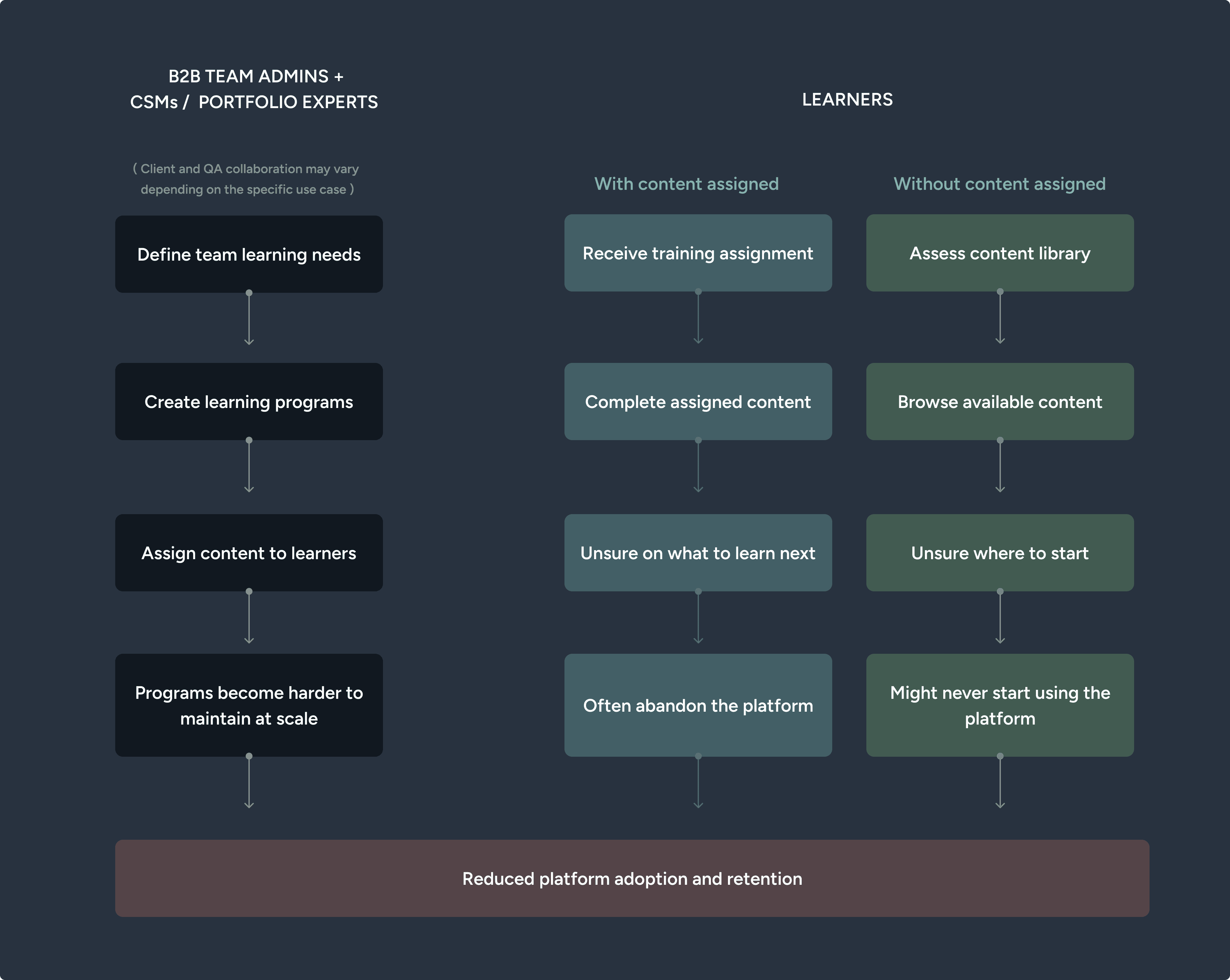
The problem was never a lack of content.
It was a lack of guidance at scale.
Instead of rebuilding personalization from scratch, I decided to reuse a Sales recommendation engine and a pre-existing AI tutor front end to create a career advisor.
The obvious answer was to give the platform real personalization: a recommendation engine that understood each learner and surfaced the right next step for them.
The problem was that our existing learning recommenders ran on old rule based logic with no genuine personalization behind them, so delivering that experience through them would have meant rebuilding the capability almost from scratch.
I did not need to go there, because the pieces already existed elsewhere. We had a recommendation engine built for the Sales team, and a front end already built for the platform tutor.
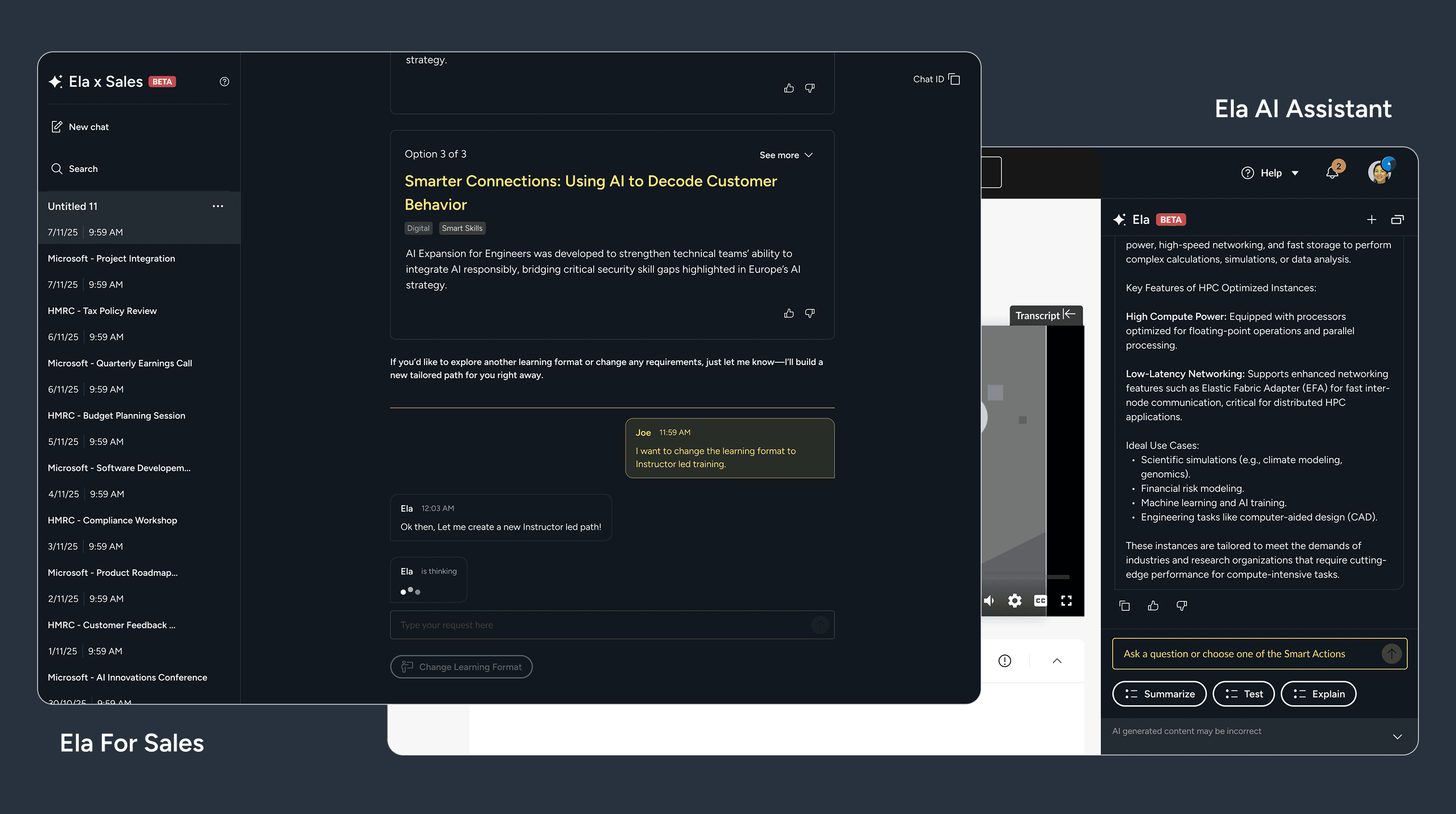
Working with engineering, I chose to adapt both into a personal career advisor rather than rebuild a learning recommender from the ground up, since that gave learners a subject matter expert they could turn to at the moment they needed direction, reused logic and interface patterns that were already proven, kept the experience consistent with the other AI touchpoints on the platform, and let us reach learners much sooner. It was the more practical path and, given what we already had, the more sensible one.
BEFORE:
Admin led program creation
Generic programs assignment
Manual curation
Content browsing
AFTER:
Learner-driven development
Personalized recommendations
AI-assisted pathway generation
Goal oriented learning
I then placed the advisor where a learner was most likely to be thinking about their development.
To increase the likelihood of meaningful engagement, I decided to plsce the Advisor on two key touchpoints:
The Dashboard, the platform's most visited page and the primary entry point for many learners.
Course completion moment, including when learners revisited completed course pages, where they were naturally evaluating their next learning step.
These touchpoints represented the strongest opportunities to connect learners with personalized guidance and content discovery.

Engagement was lower than expected, and the real reason was timing rather than recommendation quality
Engagement with the feature was lower than expected overall, and my first worry was recommendation quality.
Looking at data we found out that around 80 percent of users who opened/saw the advisor never sent it a message. It was tempting to assume the suggestions were just not good enough, but when I went back through the behavioral analytics and screen replays across both touchpoints, the picture was more specific than that.
The Dashboard placement was driving most of the real engagement, while the course completion placement had a high dismissal rate and very little meaningful interaction.
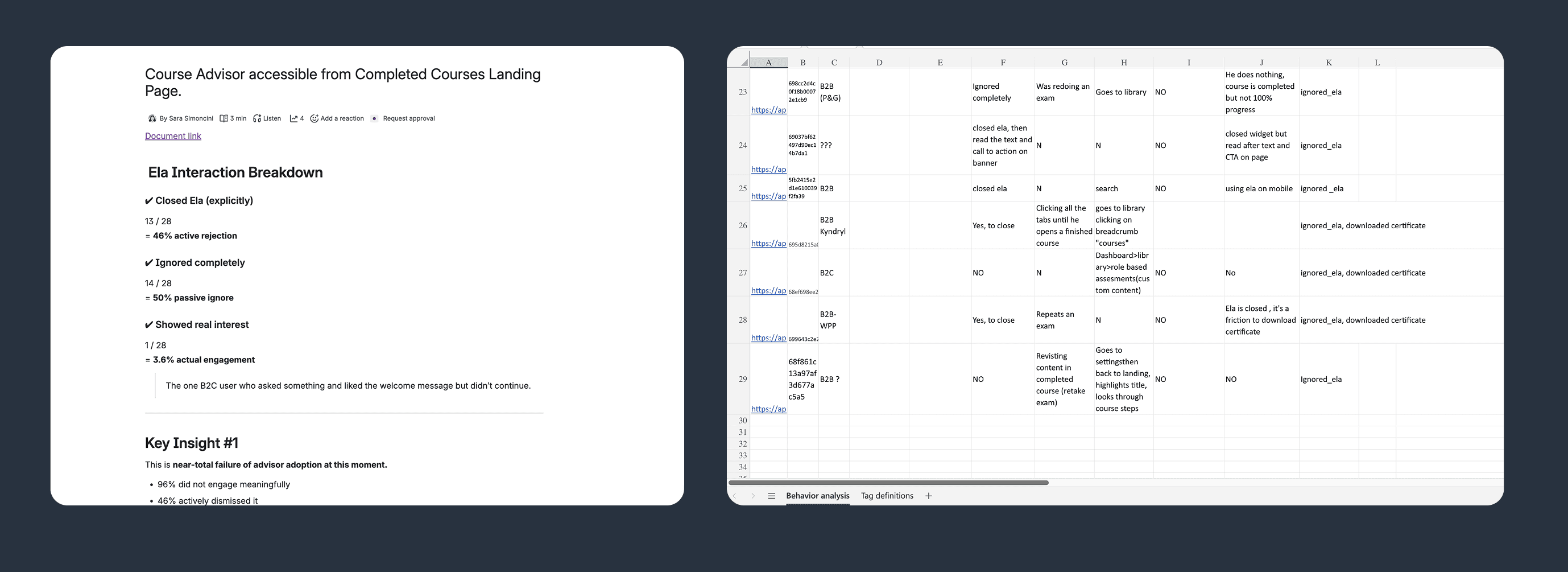
THE DATA REVEALED THAT
Dashboard placement drove most engagement
End-of-course placement saw high dismissal rates
Users rarely engaged when arriving from completion workflows
The recommendations were not the problem. I had oversimplified the user goal at the moment he found the advisor.
USERS COMPLETING COURSES WERE TYPICALLY
Retrieving certificates
Revisiting completed material to refresh learnings
Progressing through (already) assigned training
They were not in a moment of planning what to learn next, so the advisor was arriving in the right place at the wrong time.
This mattered, because once someone did engage with the advisor meaningfully, 76 percent of them went on to create a learning plan. That number told me the experience itself was working. What needed to change was the moment I introduced it.
I suggested to collapse the advisor by default at course completion so it stayed available without interrupting learners who came for something else.
I had two options at that touchpoint. I could remove the advisor from the course completion page entirely, or I could keep it there but stop it from imposing itself.
I recommended the second, changing its default state from expanded to collapsed, because removing it would have cut off learners who did want guidance in that moment, while an expanded panel was interrupting everyone who had come to the page for another reason.
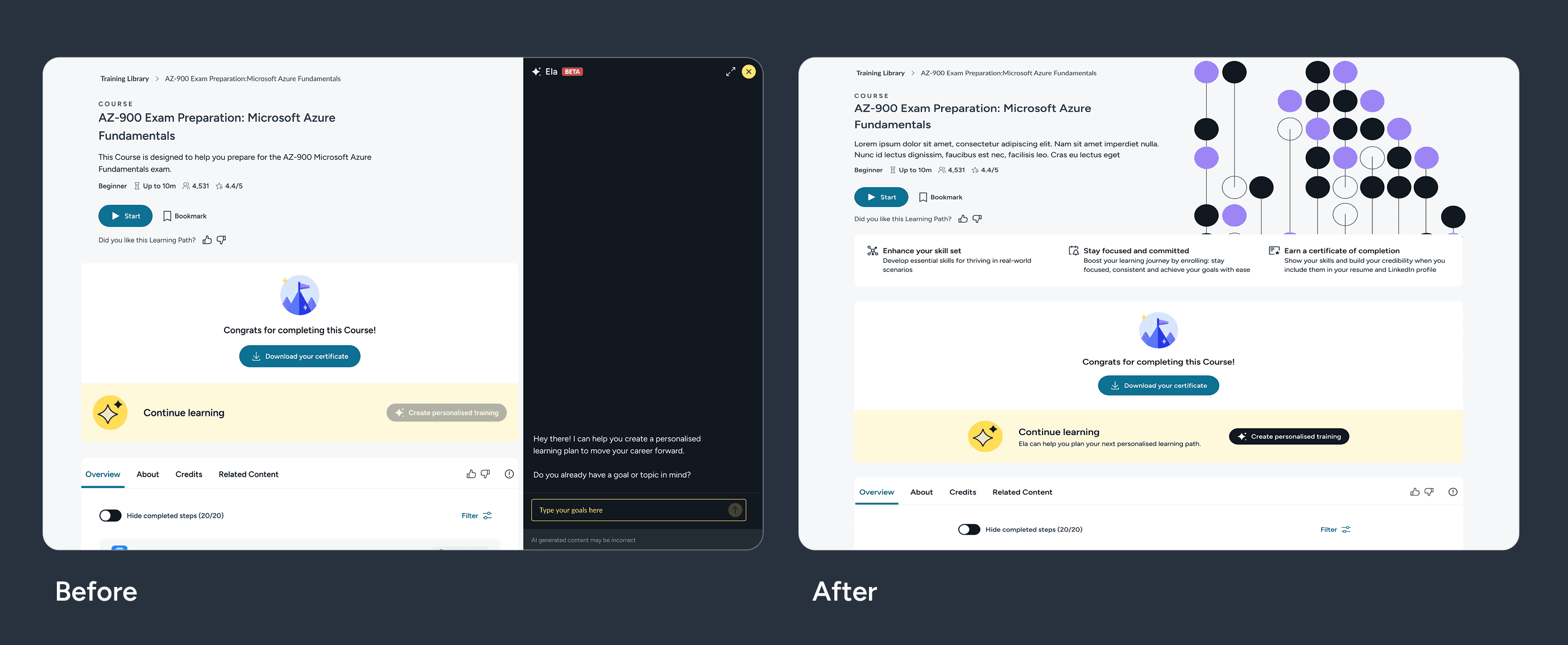
That choice was also a responsible AI decision, not only a layout one.
An advisor that shapes someone's learning path is influencing their development, and I did not want it forcing an interaction on a learner who had simply come to download a certificate.
Leaving the person in control of when to engage with the AI, rather than pushing it in front of them, is the same principle that frameworks like the EU AI Act apply to systems that touch education and skill development, and it felt like the right way to design regardless of the regulation.
The intent was to keep personalized guidance one click away without spending the learner's trust to get their attention.
The change also made the data more honest. Overall engagement went down, but that was because the numbers were no longer inflated by people who never intended to use the advisor in the first place.
When learners chose to engage, they consistently got value from it, which told me the underlying experience had been working as intended all along..
The advisor turned learning discovery into a self service experience, lifting adoption and retention while cutting manual curation
This work turned learning discovery from something that depended on manual curation into a self service experience that could actually scale.
63 percent of learners adopted AI generated learning programs, and pathways generated this way saw 70 percent retention, compared with 24 percent for direct enrollment into the content library.
What mattered most to me was that this addressed a business problem and a user problem at once: it reduced the manual burden of building and assigning programs, while helping learners find content that was relevant to them and stay engaged for longer.
63%
Adoption of AI-generated learning programs
70%
Retention on personalized AI-generated pathways VS 24% on direct content library enrollment
What I took from this: with AI features, timing and context matter more than the model itself
This project changed how I think about what makes an AI feature work. The model itself was rarely the constraint.
What decided whether people used it well was whether I understood the moment they were in, and whether the experience respected that moment instead of treating every visit as an invitation to interact.
That is the question I now ask first with any AI or agentic feature: not only whether the underlying system is capable, but whether it shows up when the person wants to actually use it, and whether they stay in control of what happens next.
Check out more projects
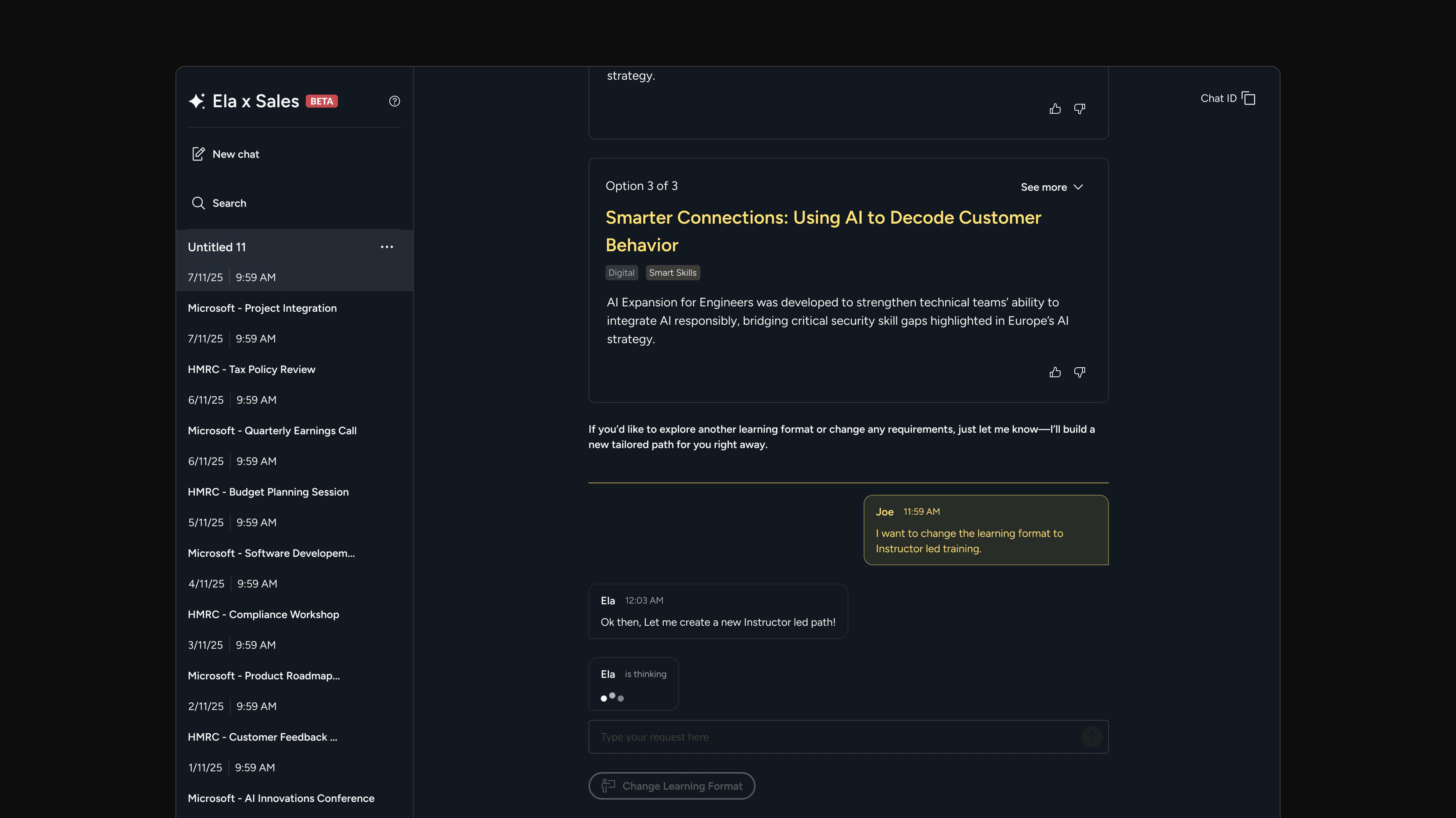
What an AI sales tool taught me about product adoption
Designed an AI tool to help sales reps create learning recommendations faster and reduce reliance on SMEs. Early adoption was promising, but over time the project revealed bigger challenges around trust, workflows, and product adoption.
Time from lead to first offer dropped
Significant reduction in SME involvement
Revealed how AI adoption depends on trust, existing workflows, and user behavior
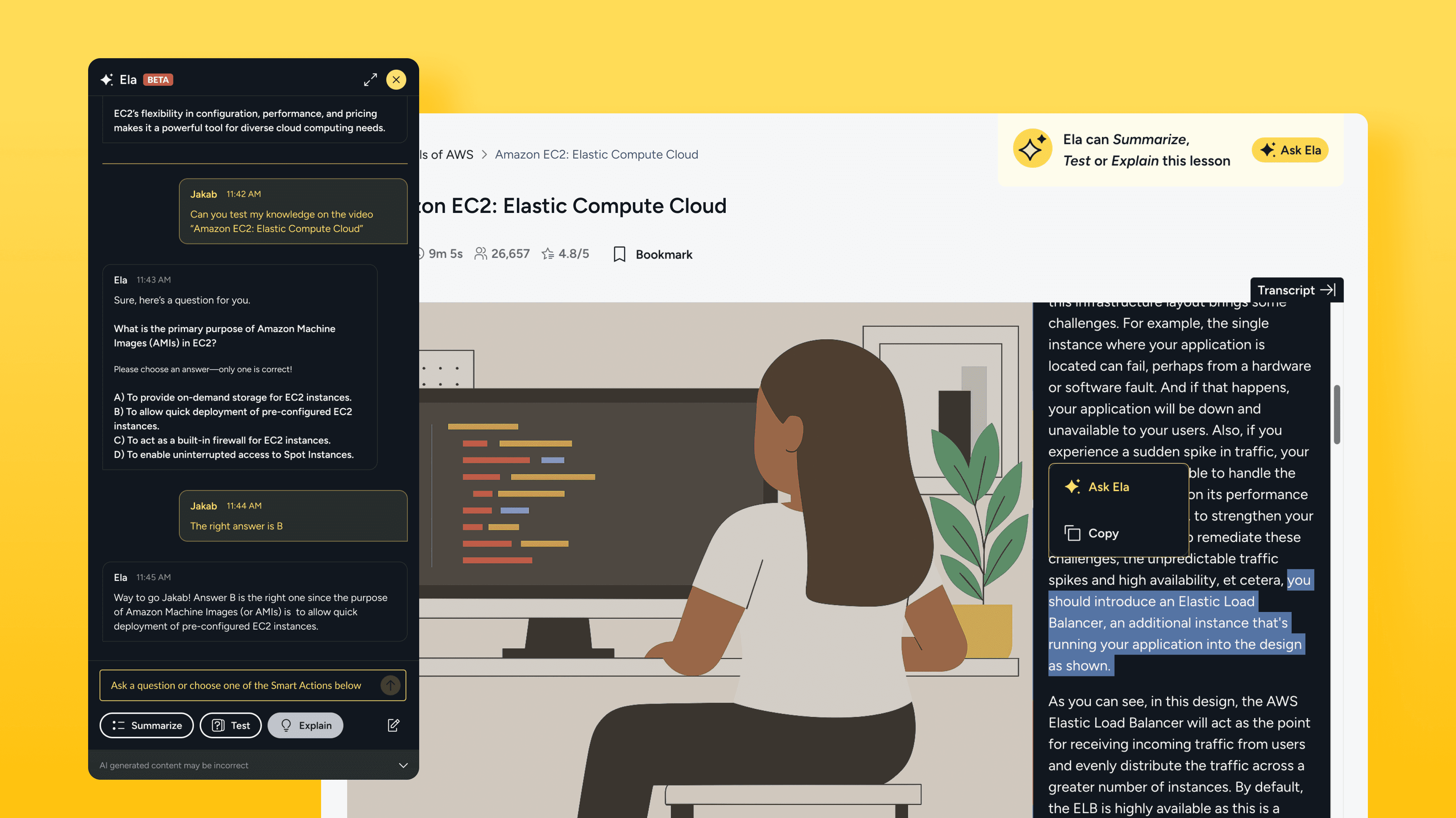
How I've helped QA users learn more confidently with an AI assistant.
I led the end-to-end design of Ela, QA’s AI-powered learning assistant, transforming an inherited prototype into a trusted and scalable product in just two months. Designed to reduce friction and support learning momentum, Ela is now adopted by 80+ client accounts, holds a 4.5/5 satisfaction score, and has influenced the development of new AI capabilities across the platform.
4.5/5 Avg. Rating
1,178 Client Accounts
+34% Adoption Growth
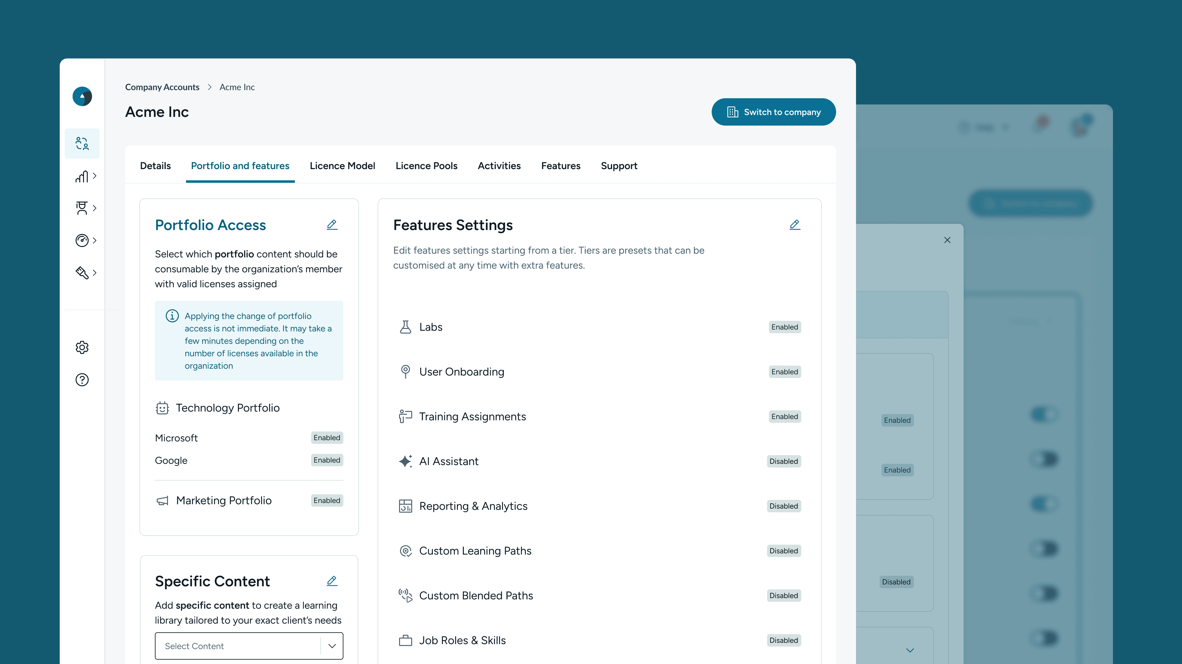
How a panel redesign helped Sales and Customer Success teams avoid critical setup errors
I redesigned a complex admin tool used daily by Sales and Customer Success teams to configure enterprise client settings. The legacy system made critical errors easy. I rebuilt it around clarity, feedback, and safer workflows, reducing support needs and user stress.
Drop in support tickets tied to misconfiguration
New CSMs reporting higher confidence earlier
+34% Adoption Growth
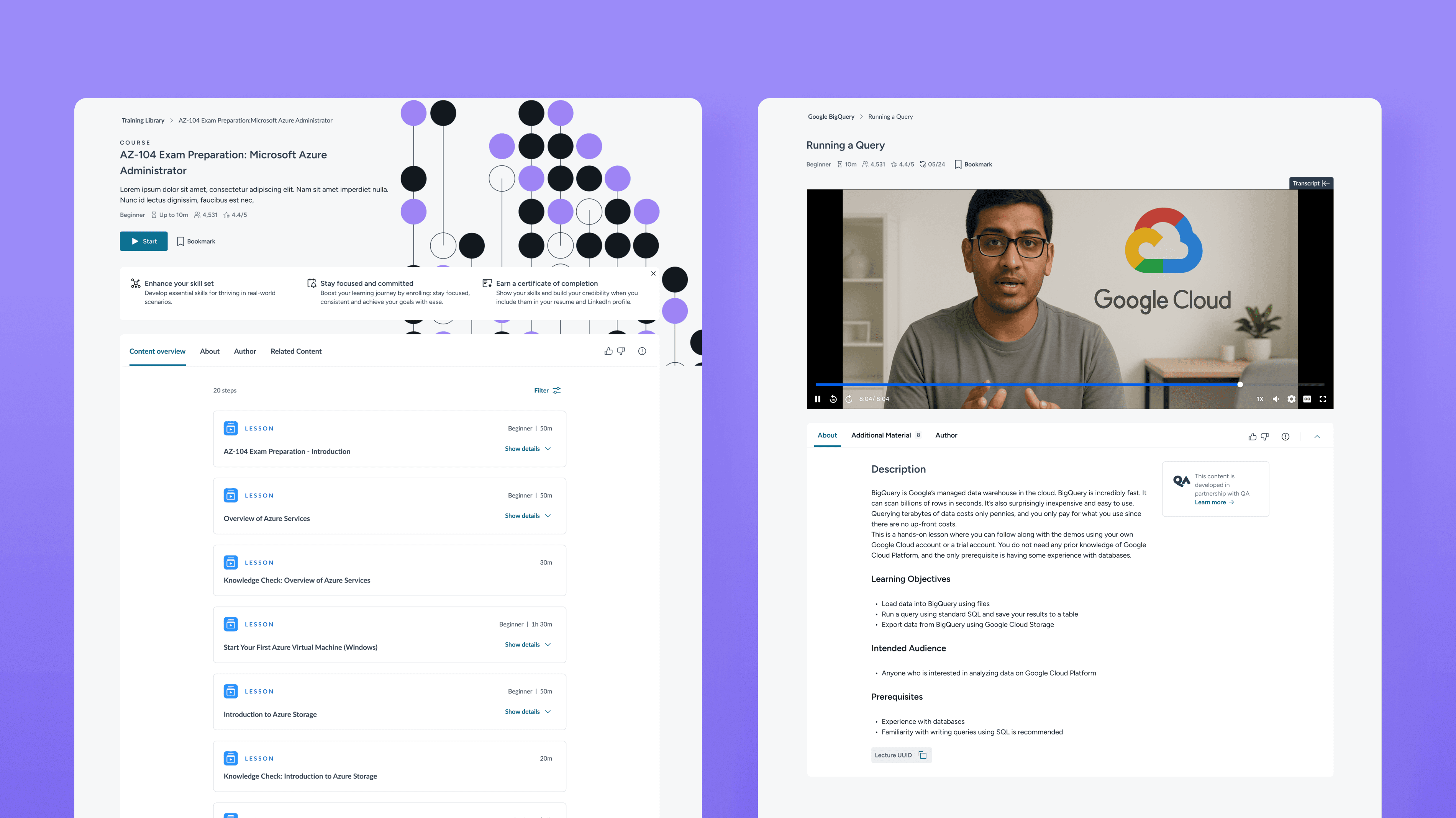
How I helped Circus Street learners feel at home after a platform transition, without increasing support burden.
I unified QA Learning’s Course and Lesson experience during the merger of Circus Street and Cloud Academy into a single platform, helping Circus Street learners adapt to a more complex UX without increasing support burden or disrupting engagement.
0 increase in helpdesk tickets: smooth client transition
Users relied less (-20%) on secondary tabs after restructuring page hierarchy

How I gamified learning at Cloud Academy boosting user motivation and MoM cashflow.
I designed a 3-month challenge that increased engagement, reduced churn, and boosted cashflow. 20% of participants stayed active three months after—well beyond typical subscription periods.
+18% increase in MoM upfront cashflow
1,178 Client Accounts
+34% Adoption Growth